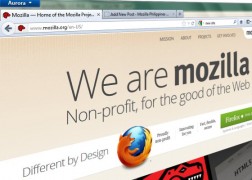
 We have recently updated the design of the website of Mozilla Philippines. This re-design is brought about by the revised website of Mozilla.org, and reflects a united vision and mission with the rest of the Mozilla international community.
The new design has the standard “Mozilla” tab on the upper right hand corner. When the Mozilla tab is clicked, it expands to show links to Mozilla products, services, information websites, and Call to Actions. The content of the Mozilla tab is the same for all websites using this theme.
These changes and the customizations were implemented by our resident web wrangler and WordPress guru, Joell Lapitan.

minor changes lang nmn po..